In a world of millions of websites, only a small percentage is truly successful. The good news is that you can determine how well you want your website to do.
Any why not? Your website is your storefront on the web. It is your most important asset on the web. Tomorrow Facebook may close, but the community you have built around your site belongs to you. For this reason, you need to invest in setting it up and ensuring that you get a positive return on investment.
What is a successful website?
A successful website is a website that meets the objectives you have set. An e-commerce website aims to generate sales and an informative site to increase brand awareness or engage in conversation with potential customers.
Whatever goal you have set for yourself, the following list will serve as a checklist to ensure that your website meets the minimum standards. This list is also useful for planning the creation of your website.
1. A successful website has a good domain name
When you plan to create a website, the first thing you need is a domain name . A domain name is the address of your website on the internet.
A good domain name is a professional domain name such as: www.myname.com . A good domain name is one that:
- represents your brand
- is short
- is easy to write and remember
- ideally ends with the extension .com
- Given the increased competition in domain names that end with the extension . com, I also offer a number of tactics to find the best alternative in case your first choice of domain name is not available .
2. It features a consistent brand identity
Your website should reflect your brand identity . As a reminder, a brand is made up of three main elements:
- the visual identity (logo, colors, typography etc.)
- the voice that represents the way the company speaks to its target
- and its values.
Maintaining a consistent identity will not only strengthen your brand image but also preserve your credibility and demonstrate your authenticity.
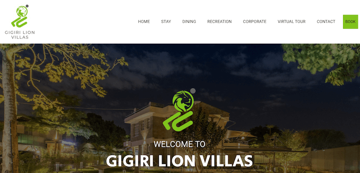
Your logo must be clearly visible on the website
In general, we position the logo in the navigation bar, on the left side or in the middle of the top of each web page. The reason is simple: most Internet users browse web pages in a Z shape.
By positioning your logo in the left corner of the header, you ensure that your logo is the first thing visitors see. Also, make sure your logo is clearly visible: there must be enough contrast between the wallpaper and the logo. Finally, its size must be relatively large, while remaining proportional to the other elements of the header.
The best place to position the logo is at the top left”

The look and feel should be the same on all pages
Ever been on a website where you felt like different pages belong to different websites? Loses you, right? Stick to your visual identity guidelines. Indeed, your website should use the color palette and typography you have selected for your brand. The link between your offline assets (letterhead, business card, etc.) and your website should be obvious. Finally, the visual of all the pages must be the same.
3. Content is the king
A basic website should at least have the following pages :
- Home
- About
- Products or Services
- Contact
Depending on the nature of your business and your sector of activity, you must have a precise idea of the pages you would like to have on your website AND prepare the content (texts, photos, videos, etc.) for each page.
Writing content that will present your business on the web is an exercise that will ask you to answer a number of questions:
- What are the pages of your website?
- What is the most important message to communicate on each page?
- Does the language and tone you use reflect the personality of your company?
- Is your value proposition clear?
The clearer your ideas are, the easier it will be to write the content of each page, to visualize the type of media to integrate to support the header.
4. A successful website is beautiful
It may seem obvious but the visual of a website is important. Even though “beautiful” is a subjective notion, there are a number of guidelines that web designers try to follow as much as possible.
It’s the era of clean websites
The website design must be clean because we are living in a minimalist world! Clean websites have become the standard in the web world. If you look at the history of the most visited websites in the world, you will realize that they have all converged on one thing: simplicity.
Easy to read text
In addition to worrying about the quality of the writing, check that your texts are readable. Pay particular attention to the typeface, the size of the characters and their color.
It is recommended to avoid handwritten fonts on the web and to use a font of at least 16 pt in order to facilitate the readability of the texts on the screen.

5. A successful website offers a good User Experience
Easy navigation
Most visitors use the menu to navigate a website, so make it an easy one to use.
Navigation is important because it is through it that users access the most important pages of the website. It must therefore be visible and well structured. The different levels of navigation must be clear and the order of the elements consistent.
If you own a complex site – a site with many pages such as a blog or a transactional site – it is recommended to display a breadcrumb trail on all the pages or at least on the pages that are not necessarily in the navigation menu.
The search bar
You saw an interesting article or product attributed to a brand and you’re on their website looking for the content. What do you do? You search! The search bar helps visitors find content that interests them quickly. It is essential for sites that have a large inventory of products, pages, or blog posts.
Always in order to facilitate navigation and the user experience, we recommend displaying the search bar in the navigation bar, next to the navigation menu so that it is clearly visible.
6. Successful Websites have Clear Calls to Action
What’s the use of a web page, or any form of marketing, without a call to action ? Calls to action or Call to Action (CTA), lead Internet users to take a desirable action on a web page. In general, they are represented by buttons on which one can read “Add to Cart”, “Read More” etc.
Marketing professionals use CTAs to encourage Internet users to pass the different stages of the “conversion funnel ”.
For example, an eCommerce site uses CTAs to encourage a user to:
- Visit a product page
- Add a product to your cart
- Finalize the sale
The conversion goal here is online shopping. CTAs ensure that the Internet user comes as close as possible to this objective. But CTAs can also be used to make site navigation smoother and more intuitive without having to use the menu.
For example, if you have an overview of your presentation on the homepage, we recommend adding a CTA like “Learn more” to lead the reader to consult the About page which is more detailed.

7. Need for Speed is an actual thing for successful websites
According to Google, 53% of mobile users abandon a session if a website takes more than 3 seconds to load. Could that with the fact that mobile accounts for the biggest chunk of website sessions and you realise the importance of a website loading fast. The speed of your website is an element that should not be overlooked.
And a website can take too long to load for a couple of reasons:
- The code is of poor quality. In this case, you should hire a professional to audit the code to improve it.
- Your site uses too many plugins that slow loading . Once again, it is your web developer who can help you improve the performance of your site at this level.
- Your site is too heavy . You can read this article on how to optimize your images for the web and lighten up pages that have a lot of images.
- Your hosting service is not good . In this case, you should consider changing hosts.
A high-performance website is optimized for all screens
The latest mobile statistics show that mobile represents the first Internet access point in the world.
Therefore, any self-respecting website must necessarily display correctly not only on computers but also on mobiles and tablets. Actually, if you have to choose, the mobile will be the first screen to optimise for. Besides the user experience, know that Google now penalizes websites that are not optimized for mobile as much from a page loading time point of view as from a design point of view. Your website should be mobile-responsive.
8. SEO is very important
There are four main ways a user can land on a web page:
- By directly typing the address of the page.
- By searching on a search engine and clicking on an organic result.
- Following a search on a search engine and clicking on an advertisement.
- When he clicks on a link in a social media post.
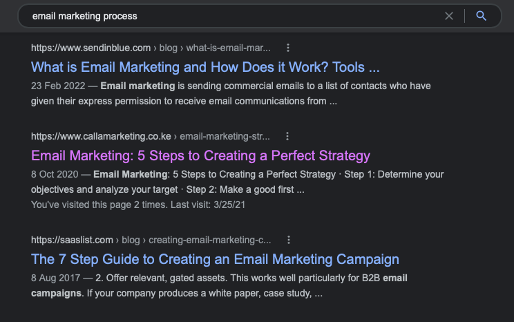
Statistics show that the vast majority of visits come from search engines and Google in particular. Organic referencing is a very important aspect that can guarantee the success of a website, if its content is of quality. Remember that natural referencing is the ability to appear in search results when a user searches for a relevant keyword. We say that a web page is well referenced when it appears in the top results of search engines.
In order to boost your website, its architecture plays an important role. Your site must be developed in such a way as to be easily accessible to search engines. Then, your content on your website is important, you must also optimize your images, offer quality content and write your texts in such a way as to optimize your ranking.

9. A successful website relies on data and analytics
In order to measure the performance of your website, you need to install web analytics tools. These tools collect information about your visitors to help you answer the following questions:
- Where do your visitors come from?
- What are the most visited pages?
- How long do they spend on your site?
- How many people are converting?
- What are the slowest pages?
Without analytics, you can’t understand your visitors’ behaviors, gather demographic data, and even calculate your revenue if your site is transactional. It is through analytics that you can identify friction points and find solutions to improve the performance of your website. Finally, it is thanks to them that you can gather enough information to make better business decisions.
As soon as possible, install traffic analysis tools. Google Analytics is the most popular tool because it is very complete, easy to install and free. I also recommend that you install the Facebook pixel if you plan to advertise on this platform.

As soon as possible, install traffic analysis tools. Google Analytics is the most popular tool because it is very complete, easy to install and free. I also recommend that you install the Facebook pixel if you plan to advertise on this platform.
10. A successful website is secure
A few years ago, only transactional sites cared about the security of transactions on their website. Today, security issues have become a concern for both companies and Internet users. So big players like Google are forcing all websites – transactional or not – to become secure. On average, 42% of Internet users believe that websites use their personal data for bad purposes.
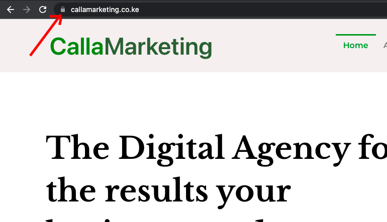
Install a security certificate (SSL certificate)
An SSL ( Secure Socket Layer ) protocol ensures the confidentiality of data exchanged between an Internet user and an application (website, email, etc.). When you install a security certificate on your website, the protocol changes from http to https. Websites that use the https protocol guarantee that the connection to their website is secure.

In Conclusion
In reality, having a successful website requires real substantive work beforehand. It is the responsibility of the company to define clear guidelines and provide all the necessary elements to guide the creative process of web technicians. In this way, the company helps them deliver a product that meets their customer’s expectations.
Calla Marketing can help you develop a successful website
We wrote this checklist because we know what makes a great website. Calla Marketing has created close to a hundred websites and can help you create, manage and market a website for you – whether you are just starting out, or you would like to upgrade to a website that delivers you business results.
Really nice!